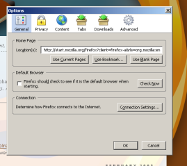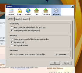
Ben finally landed the Firefox Options window in mozilla.org CVS trunk today, after months of anticipation. For those with the know-how, the code was available in non-trunk CVS on the PREFERENCES_20050101_BRANCH branch. As I have sufficient know-how, this wasn’t a big problem for me, so I created a build from the branch a couple weeks back.
The build didn’t particularly impress me. The new options window looked nice, to a degree, but it was certainly rough around the edges. The concept seemed okay, but certain parts of it just irked me. I’m hardly a UI expert, but some things just seemed completely wrong. In particular I was concerned about the use of both tabs and scrolling lists to split up large categories of options. (Luckily, this was a known problem – when talking to one of the other Firefox developers on IRC, I learned that this was a problem that would have to be addressed before the new code would be merged back into the trunk.)
Now, finally, the code’s been merged into the trunk. This means that everyone will be getting this code when they build – nightly testers, optimized build distributors, Firefox developers, etc. I don’t remember what the schedule is, but you probably can download a nightly Firefox build as of right now to test out the new options window.
What are my opinions of the window now that it’s been submitted to trunk? I’m not sure it’s as clean as the old interface (just yet), but it does have its merits.
First, the options window exhibits a much greater sense of organization than the previous one did. (“Web Features”, anyone?) Ben’s moved around options, but the moves (for the most part) make sense. Tabbed browsing is its own top-level category now. The nebulous “Web Features” is gone, and its replacement, “Content”, is much more aptly named. The advanced settings for security have been rearranged, consolidating things in as logical a way as is possible given that PSM‘s UI is completely unowned (and therefore is entirely lacking in any real sense of cleanness). In my opinion, just getting a far more sensible arrangement of options out of this makes Ben’s work on this worthwhile.
Second, Ben fixed the tabs/scrolling list issue I had, so my main complaint against it (when I’d only seen screenshots) is gone. Inconsistent UI is one of the easier problems to fix, and I’m glad to see the Firefox developers didn’t let this one slip past the review barrier.

Third, he also reworded some of the options, and for the most part I like the changes he’s made. For example, there was an option for caret browsing, which you can test out by pressing F7. (You probably can’t find it if you’re using an old build or a milestone. The option was cleverly disguised as “Move system caret with focus/selection changes” – you didn’t know that was caret browsing either, did you?) The description text has been changed to, “Allow text to be selected with the keyboard” – a clear improvement.
Fourth, I like how it looks – the old options window interface certainly wasn’t standard Windows fare, and the new options window remains just as unique while retaining all the visual appeal. Firefox does a good job of remaining uniquely itself while still conforming to the expectations of the user within his operating system of choice.
Finally, it doesn’t produce the gut “I don’t like this” feeling that beta versions of the code did – I think my gut feelings are usually pretty close to accurate, and I trust them. Overall, I think the new options interface is an improvement.
The new interface isn’t all goodness, though. First, it’s moderately buggy, and there still remain tons of issues with the new window that need to be fixed, so it’s not quite there yet. Ben’s made an excellent start at it, though, so I have confidence it’ll turn out okay.
There’s actually only one other problem with the options window; right now, I’m really not liking the fact that Ben made any changes. Why? I now have to go and document this thing.