A very interesting development has happened recently in the Firefox world on Windows: Firefox is getting a new theme. Arvid Axelsson, the creator of the current default Firefox theme Qute, explains the reasons in a post to the Mozillazine forums: essentially, the problems are that Qute hasn’t been free (perhaps not quite in the GNU sense, but roughly so) and that the Firefox devs want a more cross-platform theme. (Arvid did indicate that he would be willing to make it free if the good of Firefox required it, but it apparently occurred after the revelation that they wouldn’t consider Qute any more.)
Winstripe’s definitely a nice theme; had it been originally released as a separate theme for Windows I might even have tested it out for a nightly or two. In the past I very loosely followed the attempts to bring Pinstripe to Windows in the Mozillazine Themes forum (I found that the theme didn’t install well on whichever nightly I was using, so I only used it for about 5 minutes). Were it released as a separate theme I’d be unlikely to care, because I tend to stick close enough to the bleeding edge that I rarely install a different theme. Regardless of my feelings for Winstripe, however, I’m not a fanboy who would switch to Opera simply because of a theme change, and I’ll likely stick with the default theme no matter what it is.
I feel one important clarification must be made, however, before this should be used as the default Windows theme: this is not a Windows theme, and it should be modified until it is before its release. The Windows XP icon design guidelines explain the methods used to give icons a look that fits in with the most-used (Windows) OS on the planet that’s set the new style for Windows icons. This new theme follows these guidelines only very loosely; the instances where the new icons do fit the style are mostly byproducts of Winstripe’s original Pinstripe ancestry.
Let’s examine this new “Winstripe” theme as objectively as possible with respect to the Windows XP icon design guidelines on a point-by-point basis. First, a few disclaimers: I have no experience in (icon or other) design, relatively minimal artistic creativity, and little knowledge of the more detail-oriented changes that have already been made in Winstripe to adapt it from the Mac style to the Windows style. I also know I’ll be biased, but I’ll give being purely logical a good shot.
- Color is rich and complementary to the Windows XP look.
- No. The colors used are mostly from a small, simple palette, with little color variance, shading, or gradients within a color area; richness is mostly restricted. The colors used are mostly softened; I would describe them as dull with a sort of inner light (that nonetheless is insufficient to improve the theme’s color choices).
- Angle and perspective provide a dynamic energy to the images.
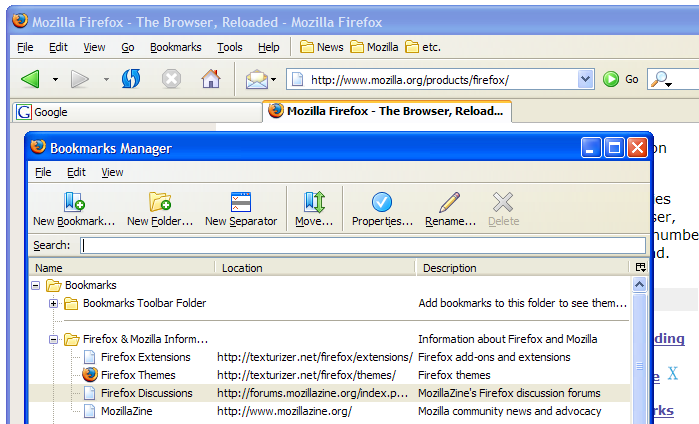
- No. The Rename icon for the bookmarks manager is the only icon with any angle. The New Folder and Folder icons for bookmarks are the only icons of the set that have any perspective. The vast majority of the icons are straight-on images, which may have been the style during the era of Windows 3.11, 95, 98, and ME but is no longer proper for a modern Windows application.
- Edges and corners of elements are soft and slightly rounded.
- Somewhat. The icons are indeed soft (in color) as mentioned earlier; this is one of the strong points of Winstripe. In the Windows XP style, softness also extends to edge blending (alpha transparency). With the notable exception of the navigation icons, such blending is almost entirely absent from Winstripe. Rounding is minimal, and icon edges are mostly hard lines (tho always softly colored) with little blending to create a smooth edge. This is arguably okay, however, per the outlines guideline below, and either choice probably represents the creator’s personal choice.
- Light source is coming from the upper left-hand corner with additional ambient light illuminating other parts of the icon.
- No. Light in the icons is not consistent. A light source from above illuminates the navigation icons, which is inconsistent with the Windows XP guideline. Other icons apparently show no strong light source. Ambient light in Winstripe icons is strong, and all aspects of the icons are clear.
- The use of gradients provides dimension and gives the icon a richer look.
- Yes. Gradients used are very subtle, while Windows XP gradients tend to be more visible. The gradients, however, do almost nothing to give the icon a richer look because they are too subtle. (This is a minor nit overall, and this examination is supposed to be as objective as possible. Therefore, against my wishes, I’m giving it a Yes here.)
- A drop shadow provides contrast and dimension.
- No. Only the navigation icons have drop shadows, but the canonical settings for drop shadows in Windows XP are at an angle. Furthermore, the other icons have no drop shadows whatsoever; the pencil for Rename at the very least deserves a slight drop shadow.
- Outlines provide definition.
- Yes. Outlines are strong and clear in Winstripe.
- Everyday objects, such as computers and devices, have a more modern consumer look.
- Uncertain. I do not believe the icons displayed can sufficiently demonstrate compliance or a lack of compliance to this guideline. The bookmarks symbol might be considered somewhat antiquated (what mainstream computer user really uses actual, stylized bookmarks?), and the house is rather too traditional; however, two icons (only one whose base design is truly unusual for Windows) are not enough to respond to this guideline.
How many of these eight guidelines does Winstripe follow? Two (with one other as a “possibly” and one as only partially obedient). I recognize that these are only guidelines; a designer can feel free to ignore them and still create good icons. If the guidelines are ignored, however, the designer must certainly expect to have produced icons not well-suited for Windows XP. Those guidelines that Winstripe follows are only followed because the OS X style and the Windows XP style coincided. The vast majority of the guidelines are ignored to the detriment of a future Firefox’s native OS integration. I do not recommend the icons be completely refactored to fit every guideline (as one must remember they are), but a good deal of effort must be expended to align Winstripe with the Windows XP style.
Having a consistent theme for Firefox on all platforms is a laudable idea — I have no qualms about making one theme with minor changes to suit all platforms. Using a Mac OS X theme as the base for this new cross-platform theme, however, is a mistake. Jon Hicks and the team that created the new Firefox icon have shown that an excellent design can function extremely well in all platforms (despite my initial impression that it was oh-so-slightly too Mac-ish), and I’ve heard almost no complaints about the Firefox icon. I would love to see what that team could do to create a cross-platform default theme, because I’m sure they could create one that would not favor any platform over any other. Winstripe, however, simply does not integrate with a Windows environment.
Presumably there will also be a Winstripe for Thunderbird for the same reasons, but I haven’t seen any mention of it in Bonsai logs or in posts to other sites.
Thanks for the well thought out critique. I do hope you post a follow up when you’ve had the chance to use the theme. One thing I notice right away though: The angled perspective seems to refer to mostly application icons rather than toolbar icons. In practice, the Windows XP style toolbar icons have a perspective of straight on, with a few exceptions like IE’s home icon.
Comment by Kevin — 06.06.04 @ 21:25
Is Winstripe really THAT bad?
In these few days there are lots of discussion about the Firefox’s new default theme: Winstripe.
Most of the feedbacks are negative. I wonder why people hate this theme so much. Personally I think it is OK, and it looks brighter than the current (…
Trackback by ubiquitous minghong - My Blogger — 08.06.04 @ 00:32
Has it occured to anyone that not everyone uses XP and not everyone likes that “cute” look of it. I, for one, can’t stand XP and that awful Luna look. I just wish everyone that keeps references the XP guidelines realizes that there are a lot of people who actually DONT like the XP look
Comment by Zach — 09.06.04 @ 09:22
Zach:
Certainly. I never use the Luna theme while I’m on XP – I like Classic much more.
However, most people never change the theme. Also, icons in XP are not changed when the theme changes. Open up IE in Luna, then again in Classic. The icons in the toolbar are exactly the same. The same is true for the program icons (take a look through Program Files->Accessories). In any case most new programs are following these guidelines, so it makes sense for Firefox to do so as well.
Besides, the people who really don’t like Luna are usually the ones who are smart enough to know how to change it (or in this instance, download a different Firefox theme).
Comment by Jeff — 09.06.04 @ 11:22