Resizing backgrounds in CSS
The CSS background-image property allows web developers to add backgrounds to parts of pages, but only at their original sizes. CSS 3 added background-size to resize background images, and I implemented it in Gecko. But I couldn’t implement it for SVG backgrounds, because Gecko didn’t support them. When support arrived, nobody updated the background sizing algorithm for vector images’ increased flexibility. I’d hoped to prevent this omission by adding “canary” tests for background-size-modified SVG backgrounds. But I miswrote the tests, so background-size wasn’t updated for SVG-in-CSS.
Since I’d inadvertently allowed this mess to happen, I felt somewhat obligated to fix it. Starting with Firefox 8, Firefox will properly render backgrounds which are vector images, at the appropriate size required by the corresponding background-size. To the best of my knowledge Gecko is the first browser engine to properly render vector images in CSS backgrounds.
How do images scale in backgrounds now?
It’s complicated: so complicated that to have any real confidence in complete correctness of a fix, I generated tests for the Cartesian product of several different variables, then manually assigned an expected rendering to those 200-odd tests. It was the only way to be sure I’d implemented every last corner correctly. (In case you’re wondering, these tests have been submitted to the CSS test suite where they await review. That should be lots of fun, I’m sure!)
Still, the algorithm can mostly (but not entirely!) be summarized by following a short list of rules:
- If
background-sizespecifies a fixed dimension (percentages and relative units are fixed by context), that wins. - If the image has an intrinsic ratio (its width-height ratio is constant — 16:9, 4:3, 2.39:1, 1:1, &c.), the rendered size preserves that ratio.
- If the image specifies a size and isn’t modified by
containorcover, that size wins. - With no other information, the rendered size is the corresponding size of the background area.
Note that sizing only cares about the image’s dimensions and proportions, or lack thereof. A vector-based image with fixed dimensions will be treated identically to a pixel-based image of the same size.
Subsequent examples use the following highly-artistic images:
| File name | Image (at 150×150) | Description |
|---|---|---|
no-dimensions-or-ratio.svg |
 |
This image is dimensionless and proportionless: think of it like a gradient desktop background that you could use on a 1024×768 screen as readily as on a 1920×1080 screen. |
100px-wide-no-height-or-ratio.svg |
 |
This image is 100 pixels wide but has no height or intrinsic ratio. Imagine it as a thin strip of wallpaper that could be stretched the entire height of a webpage. |
100px-height-3x4-ratio.svg |
 |
This image is 100 pixels high but lacks a width, and it has an intrinsic ratio of 3:4. The ratio ensures that its width:height ratio is always 3:4, unless it’s deliberately scaled to a disproportionate size. (One dimension and an intrinsic ratio is really no different from two dimensions, but it’s still useful as an example.) |
no-dimensions-1x1-ratio.svg |
 |
This image has no width or height, but it has an intrinsic ratio of 1:1. Think of it as a program icon: always square, just as usable at 32×32 or 128×128 or 512×512. |
In the examples below, all enclosing rectangles are 300 pixels wide and 200 pixels tall. Also, all backgrounds have background-repeat: no-repeat for easier understanding. Note that the demos below are all the expected rendering, not the actual rendering in your browser. See how your browser actually does on this demo page, and download an Aurora or Beta build (or even a nightly) to see the demo rendered correctly.
Now consider the rules while moving through these questions to address all possible background-size values.
Does the background-size specify fixed lengths for both dimensions?
Per rule 1, fixed lengths always win, so we always use them.
background: url(no-dimensions-or-ratio.svg);background-size: 125px 175px;
background: url(100px-wide-no-height-or-ratio.svg);background-size: 250px 150px;
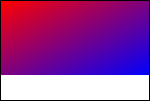
background: url(100px-height-3x4-ratio.svg);background-size: 275px 125px;
background: url(no-dimensions-1x1-ratio.svg);background-size: 250px 100px;Is the background-size contain or cover?
cover makes the picture as small as possible to cover the background area. contain makes the picture as large as possible while still fitting in the background area. For an image with an intrinsic ratio, exactly one size matches the cover/fit criteria alone. But for a vector image lacking an intrinsic ratio, cover/fit is insufficient, so the large/small constraints choose the resulting rendered size.
Rule 1 is irrelevant, so try rule 2: preserve any intrinsic ratio (while respecting contain/cover). Preserving a 3:4 intrinsic ratio for a 300×200 box with contain, for example, means drawing a 150×200 background.

background: url(100px-height-3x4-ratio.svg);background-size: contain;
background: url(100px-height-3x4-ratio.svg);background-size: cover;
background: url(no-dimensions-1x1-ratio.svg);background-size: contain;
background: url(no-dimensions-1x1-ratio.svg);background-size: cover;Rule 3 is irrelevant, so if there’s no intrinsic ratio, then per rule 4, the background image covers the entire background area, satisfying the largest-or-smallest constraint.

background: url(no-dimensions-or-ratio.svg);background-size: contain;
background: url(100px-wide-no-height-or-ratio.svg);background-size: contain;Is the background-size auto or auto auto?
Per rule 2, rendering must preserve any intrinsic ratio.
If we have an intrinsic ratio, any dimension (or both) fixes the other, and we’re done. If we have an intrinsic ratio but no dimensions, then per rule 4, we use the background area — but see rule 2! To preserve the intrinsic ratio, the image is rendered as if for contain.
background: url(100px-height-3x4-ratio.svg);background-size: auto auto;
background: url(no-dimensions-1x1-ratio.svg);background-size: auto auto;If we have no intrinsic ratio, then per rule 3, we use the image’s dimension if available, and per rule 4, the corresponding background area dimension if not.
background: url(no-dimensions-or-ratio.svg);background-size: auto auto;
background: url(100px-wide-no-height-or-ratio.svg);background-size: auto auto;The background-size is one auto and one length.
Per rule 1 we use the specified dimension, so we have one dimension to determine.
If we have an intrinsic ratio, rule 2 plus the specified dimension determines rendering size.
background: url(100px-height-3x4-ratio.svg);background-size: 150px auto;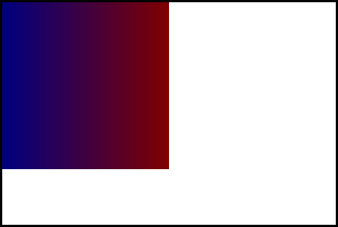
background: url(no-dimensions-1x1-ratio.svg);background-size: 150px auto;Otherwise, per rule 3 we consult the image, using the image’s dimension if it has it. If it doesn’t, per rule 4, we use the background area’s dimension. Either way, we have our rendered size.
background: url(no-dimensions-or-ratio.svg);background-size: auto 150px;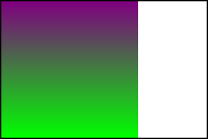
background: url(100px-wide-no-height-or-ratio.svg);background-size: 200px auto;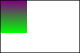
background: url(100px-wide-no-height-or-ratio.svg);background-size: auto 125px;Whee, that’s a mouthful!
Yes. Yes it is. (Two hundred tests, remember?) But it’s shiny!
Anything else to know?
In rewriting the sizing algorithm, I was confronted with the problem of how to resize CSS gradients (distinct from gradients embedded in SVG images), which CSS treats as an image subtype.
Our previous sizing algorithm happened to treat gradients as if they were a special image type which magically inherited the intrinsic ratio of their context. Thus if the background were resized with a single length, the gradient would paint over a proportional part of the background area. Other resizing would simply expand them to cover the background area.
CSS 3 Image Values specifies the nature of the images represented by gradients: they have no dimensions and no intrinsic ratio. Firefox 8 implements these semantics, which are a change from gradient rendering semantics in previous releases. This will affect rendering only in the case where background-size is auto <length> or <length> auto (and equivalently, simply <length>). Thus if you wish to resize a gradient background, you should not use a length in concert with auto to do so, because in that case rendering will vary across browsers.
Conclusion
SVG background images have now become more powerful than you can possibly imagine. If the SVG has fixed dimensions, it’ll work like any raster image. But SVG goes beyond this: if an SVG image only has partial fixed dimensions, the final rendering will respect that partial dimension information. Proportioned images will remain proportioned (unless you force them out of proportion); they won’t be disproportionally stretched just because the background area has particular dimensions. Images with a dimension but no intrinsic ratio will have the dimension used when the background is auto-sized, rather than simply have it be ignored. These aren’t just bugfixes: they’re new functionality for the web developer’s toolbox.
Now go out and make better shiny with this than I have. 🙂
